
Why I Started Looking for AI Infographic Tools
I used to spend 3-4 hours making a single infographic in traditional design tools for my social media and blog content. Aligning layouts, finding matching icons, tweaking colors over and over. The process was painfully slow.
Hiring a designer? Not cost-effective. A professionally designed infographic typically costs between $100 and $800.
Then AI infographic generators changed the rules of this industry. You no longer need to start from a blank canvas. Just describe what you want, and AI can produce a professional infographic in seconds or minutes.
But here's the problem: in 2026, there are dozens of AI infographic tools on the market, with massive differences in quality, features, and pricing. Some are all-in-one design platforms where infographics are just a side feature; some specialize in data visualization; and others are purpose-built for turning knowledge content into visual presentations.
Over the past few weeks, I tested all the major AI infographic generators on the market. I used the same content on each platform to evaluate every tool under identical conditions.
Out of all the products I've used, here are the 5 best AI infographic generator websites, with honest pros and cons for each.
My Selection Criteria
Before diving into the reviews, here are the dimensions I used to evaluate each tool:
- AI Capability: How smart is the AI? Can it understand your content and automatically generate meaningful layouts, or does it just paste text onto templates?
- Template Quality & Variety: Are the templates modern, professional, and covering different use cases?
- Ease of Use: Can a non-designer produce a good-looking result within 10 minutes?
- Output Quality: Is the final infographic professional enough to publish directly? Is text rendering accurate?
- Price & Value: Can individuals and small teams afford it? What do you get on the free plan?
- Workflow Fit: Can it integrate smoothly into your existing content creation workflow?
Quick Comparison: 5 Best AI Infographic Generators at a Glance
| Tool | Best For | Core AI Feature | Starting Price | Rating |
|---|---|---|---|---|
| CartoMind | Knowledge management → automated infographic workflow | Auto-organize knowledge + match best design | Free | 4.8/5 |
| Piktochart | Data-driven infographics for enterprises | Block editor + Google Sheets live integration | $10/mo (annual) | 4.7/5 |
| Canva | All-in-one design needs | Magic Design + 20 AI tools | $15/mo | 4.8/5 |
| Venngage | Professional infographics + accessibility compliance | 22 AI generators + WCAG compliance | $10/mo (annual) | 4.7/5 |
| Infogram | Data visualization + web embedding | AI chart recommendations + interactive elements | $19/mo (annual) | 4.6/5 |
Key Takeaways
- CartoMind: Lightweight knowledge management plus fully automated design workflow, best for those who need to continuously produce infographics from documents and notes. Highest automation level on this list.
- Piktochart: Block editor plus Google Sheets live integration, best for enterprise teams working with data reports.
- Canva: Broad ecosystem coverage, best for those who need infographics, videos, presentations, and other design types simultaneously.
- Venngage: Built-in WCAG accessibility compliance checks, best for government and educational institutions with regulatory requirements.
- Infogram: Interactive charts plus web embedding, best for media and analytics teams publishing interactive data content on the web.
Best AI Infographic Generators: Detailed Reviews
1. CartoMind. A Different Approach: When Knowledge Management Meets Infographic Design

CartoMind is the newest AI infographic tool of 2026, and what caught my attention is that it approaches the problem from a completely different angle than most products on the market.
The name itself hints at the philosophy: Carto (from Cartography) + Mind (thinking).
Its logic is: creating a good infographic is essentially a cartographer's job, understanding information, filtering key points, and designing a clear visual layout. CartoMind advocates "zero prompting," automating this entire design process with AI, while still preserving the user's freedom to adjust and customize.
CartoMind also provides lightweight knowledge note management. Many infographic tools on the market today either have no knowledge management capability at all, or are like NotebookLM, which is excellent at knowledge management, but infographic generation is just an add-on feature that gives you neither design freedom nor rich infographic templates.
Other tools start from a blank canvas or template library. CartoMind starts from your content. The workflow goes like this:
- Upload documents. PDF, Word, TXT, Markdown, or paste text directly. The system automatically parses and splits content into knowledge notes.
- Select segments. Instead of feeding the entire document to AI, you pick the specific paragraphs you want to visualize. This gives you precise control over content.
- Auto-generate. AI extracts key information elements and matches the best design from 500+ built-in template combinations. Layout, color scheme, and typography are all handled automatically.
The core difference is: you don't need to write prompts, and you don't need to browse templates. You select content, and AI decides the best way to visualize it.
Its Position in the Market
Most AI infographic tools fall into two camps:
- Design-first tools (like Canva, Piktochart) have strong editors and templates, but you still need to manually extract and organize content before designing.
- Knowledge-first tools (like NotebookLM) are great at organizing information, but infographic output is just an afterthought, with limited design quality.
CartoMind sits between these two. It's not as rich in raw editing capabilities as Canva or Piktochart, but it eliminates the content preparation steps those tools require.
Core Features
- Knowledge Note Management. Upload multi-format files, auto-parse text, organize into selectable segments
- AI Content Extraction. Identifies data points, processes, comparisons, hierarchies, and timelines from text
- Smart Template Matching. Matches content structure with the optimal design from 500+ professional combinations
- Fully Automated Design. No template browsing, no color picking; AI handles all design decisions
- Multi-Format Input. PDF, Word, TXT, Markdown, plain text paste
🟢 Pros
- Unique lightweight note management system where knowledge can be accumulated and reused, no need to switch between note apps and design tools
- 500+ design combinations and extensive image templates, providing design diversity without choice paralysis
- Truly zero design skills required, fully automated from content to finished product
- Supports multiple document format inputs
- Generated infographics support any language
- One of the most affordable paid plans on this list (free monthly credits + $9/mo annual)
🔴 Cons
- Relatively new product, smaller community and fewer third-party resources than mature tools
- Template library (500+) is smaller than Canva (1M+)
- Less manual design control if you want to fine-tune specific layout elements
Best For
Content marketers making infographics from research materials or articles, educators converting course content into visual aids, social media creators who need to continuously produce visual content from text, and anyone whose bottleneck is content organization rather than design skills.
User Reviews
"I used to spend 20 minutes just deciding which template to use. With CartoMind I paste my notes and it picks the right layout for me. Saves me a ton of time every week." Alex M., Content Marketer, Product Hunt
2. Piktochart. Data-Driven Infographic Tool for Enterprise Teams
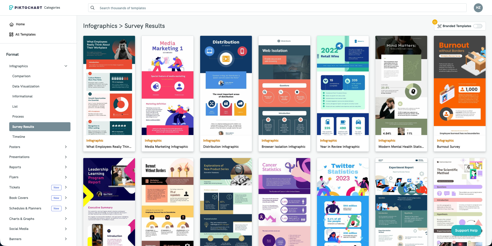
Piktochart has been in the visual content space for over a decade, serving 14 million users globally and creating over 220 million visual assets in total. Unlike general-purpose design platforms, Piktochart was built from the start around one thing: turning data and long-form text into structured visual content.
Its differentiator is the block-based editor. While tools like Canva use a single-page canvas approach, Piktochart uses modular content blocks that you can independently add, move, or delete. This makes it particularly effective for creating long-form infographics, annual reports, and multi-section data summaries, with far more layout flexibility than single-page tools.
Data integration is where Piktochart truly stands apart. You can directly link Google Sheets, and charts will automatically update as your data changes. The built-in interactive maps can automatically color different countries/regions based on your dataset, which is very practical for creating global reports. If your work primarily involves data visualization, these features save considerable effort compared to manually rebuilding charts in a general design tool.
However, Piktochart's template aesthetics lean toward traditional business style. The overall template style is formal and corporate, making it less suitable for social media or content that aims for a casual, trendy feel. If your primary need is visual trendiness, other tools may be more appropriate.
Core Features
- Block-Based Editor: Modular long-form editing, easily add, move, or delete content blocks
- Live Data Links: Direct Google Sheets connection, charts auto-update with data changes
- Interactive Maps: Auto-color countries/regions based on data, ideal for global reports
- AI Infographic Generator: Paste text or upload documents to generate structured infographics
- Brand Kit: Save brand colors, fonts, and logos for one-click brand consistency
- Enterprise Permission Management: Role-based access control for enterprise teams
🟢 Pros
- Block-based editor excels at long-form, multi-section infographics
- Google Sheets live integration eliminates manual chart updates
- Interactive maps are a genuine differentiator for data-intensive global reports
- Mature Brand Kit and enterprise-grade permission management
- Special discounts for education and nonprofits
🔴 Cons
- Template style leans formal/corporate, less suitable for casual social media content
- PDF/PowerPoint export requires paid Business plan
- AI Credits deplete quickly, heavy users may need to upgrade
- Video editing features exist but are basic compared to dedicated video tools
Best For
HR departments, finance teams, data analysts, corporate communications, and consultants who regularly produce data-driven reports, long-form infographics, and internal presentations.
User Reviews
"It takes something as simple as a text or document and turns it into a clean, professional design in seconds." Frank Morrone, Product Hunt
3. Canva. The Comprehensive Design Platform with Broad Coverage
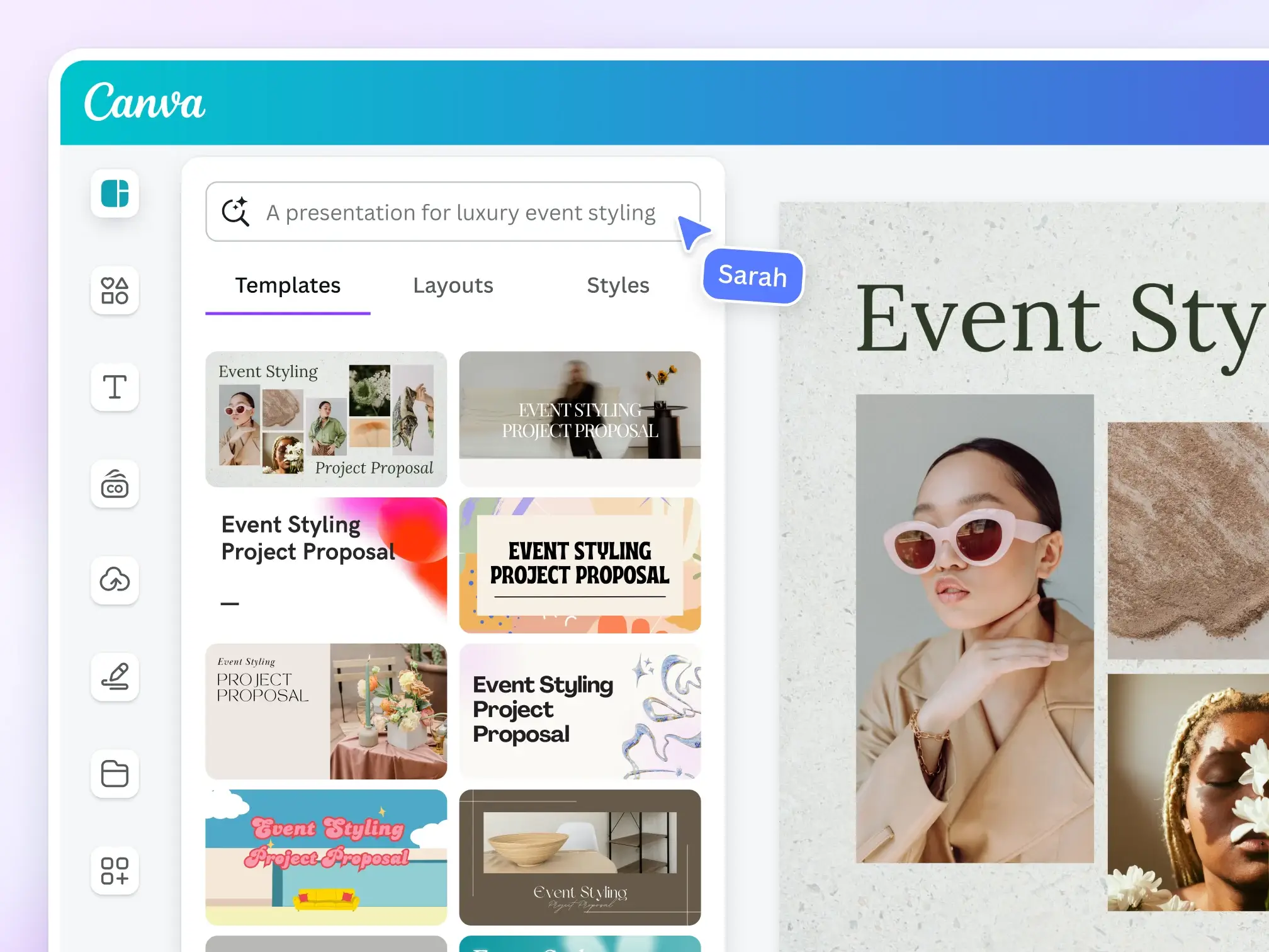
You probably already have a Canva account. Over 220 million people do. Because Canva is mature in the design space. But how does it perform specifically for AI infographic generation?
The answer is: solid, but not focused. When I used Magic Design to create a test infographic, the result was visually appealing, and the AI correctly interpreted my data. But compared to dedicated infographic tools, I needed more manual adjustments. Canva's AI is a generalist. It does everything reasonably well, but that also means it lacks depth in the infographic domain.
Where Canva truly shines is its ecosystem. After creating an infographic, I can immediately resize it for Instagram Stories, add animations for a presentation, put it into a Canva Doc, or export it as video. All without leaving the platform. If infographics are just one part of your content workflow, this versatility is a clear advantage.
The AI feature suite is broad: Magic Design generates layouts from prompts, Magic Write handles copy, Magic Edit modifies images with natural language, Magic Animate auto-adds motion effects, and the recently launched Magic Layers (March 2026) can convert flat images into editable multi-layer designs. In April 2026, Canva released its "AI 2.0" update, described as its biggest push toward replacing traditional design with prompts.
Core Features
- Magic Design. Generate complete designs from text prompts or uploaded media
- Magic Write. AI copywriting assistant
- Magic Edit/Eraser/Expand/Morph. Complete AI image processing suite
- Magic Animate. Auto-add animations to any static design
- Magic Layers. Convert static images to editable multi-layer designs (launched March 2026)
- 1M+ Templates. Template library leads among peers
- Dream Lab. Advanced AI image generation (based on acquired Leonardo AI)
🟢 Pros
- Massive user base (220M+), rich community, tutorials, and ecosystem resources
- Outstanding template library scale (1M+ free, more with Pro)
- High AI feature update frequency (Magic series continuously iterating)
- Complete content workflow: design → video → docs → presentations in one tool
- Free plan is sufficient for basic infographics
- All platforms: web, desktop, iOS, Android
🔴 Cons
- Infographics are not the core focus. Does everything, but no deep optimization for infographics
- AI features scattered across multiple "Magic" tools rather than a unified infographic workflow
- Pro starting price is on the higher side for individuals (~$15/mo)
- Too many templates, excessive choice leads to decision fatigue
- Lacks specialized infographic intelligence (data visualization, knowledge extraction)
Best For
People who need infographics as part of a broader content creation workflow. Students, freelancers, small business owners, social media managers, and marketing teams that simultaneously need presentations, social posts, and videos.
User Reviews
"You can create a slide, create a presentation, create infographics and you can also create images from scratch." Leonardo D., Marketing Manager
4. Venngage. Focused on Infographics, with Built-In Accessibility Compliance
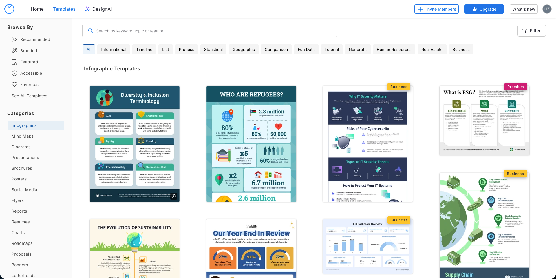
If infographics are your primary output (not a side task), Venngage deserves attention. Canva tries to be everything, Piktochart leans toward data reports, while Venngage builds its entire product identity around one thing: turning complex information into clearly structured visual reports.
Unlike Canva's "aesthetics-first" logic, Venngage's templates are designed to serve information hierarchy. They're built for white papers, project plans, and technical reports, where data organization matters more than visual flair. The platform offers 22 specialized AI generators (timelines, flowcharts, comparison charts, brochures, etc.), each understanding the structural conventions of its specific document type.
The real differentiator is accessibility compliance. Venngage is the only tool on this list with built-in WCAG 2.1 AA compliance checking. Its Smart Accessibility AI automatically generates alt text, checks color contrast, and evaluates font readability, ensuring your infographics meet ADA requirements. For government agencies and educational institutions with legal accessibility obligations, this is not optional.
But there are tradeoffs. The editor interface style is relatively traditional, and some users report performance degradation with content-heavy projects. Templates follow structured frameworks, which helps maintain consistency, but flexibility is limited if you need highly custom layouts outside preset structures.
Core Features
- DesignAI Generator. Natural language to professional infographics
- AI Branding Automation. Auto-extract brand colors, fonts, logos and apply globally
- AI Content Auto-Fill. AI automatically fills content after template selection
- Smart Accessibility AI. WCAG 2.1 AA compliance checking, auto alt text, contrast verification
- AI Writer & Translation. Enhance text clarity, instant multilingual translation
- 22 Specialized AI Generators. Each optimized for its document type (timelines, flowcharts, comparisons, etc.)
🟢 Pros
- Templates designed for information hierarchy, not just aesthetics but structured data presentation
- WCAG/ADA accessibility compliance is a real requirement for regulated industries
- 22 specialized AI generators cover most business document types
- AI Branding Automation makes brand consistency effortless
- Smart chart style retention when importing data (CSV, Google Sheets)
- Premium at $10/mo annual is reasonable for this level of specialization
🔴 Cons
- Editor interface style is relatively traditional, performance may degrade with heavy content
- Structured templates favor consistency but limit creative freedom
- Static output formats only, no interactive/embeddable content
Best For
Government and educational institutions with WCAG/ADA compliance requirements, consulting firms producing structured client reports, and HR/finance teams that need to quickly turn complex data into professional documents.
User Reviews
"Venngage is the easiest way I know of to make infographics." Nathan R., SEO Analyst
5. Infogram. Interactive Data Visualization for Web Publishing
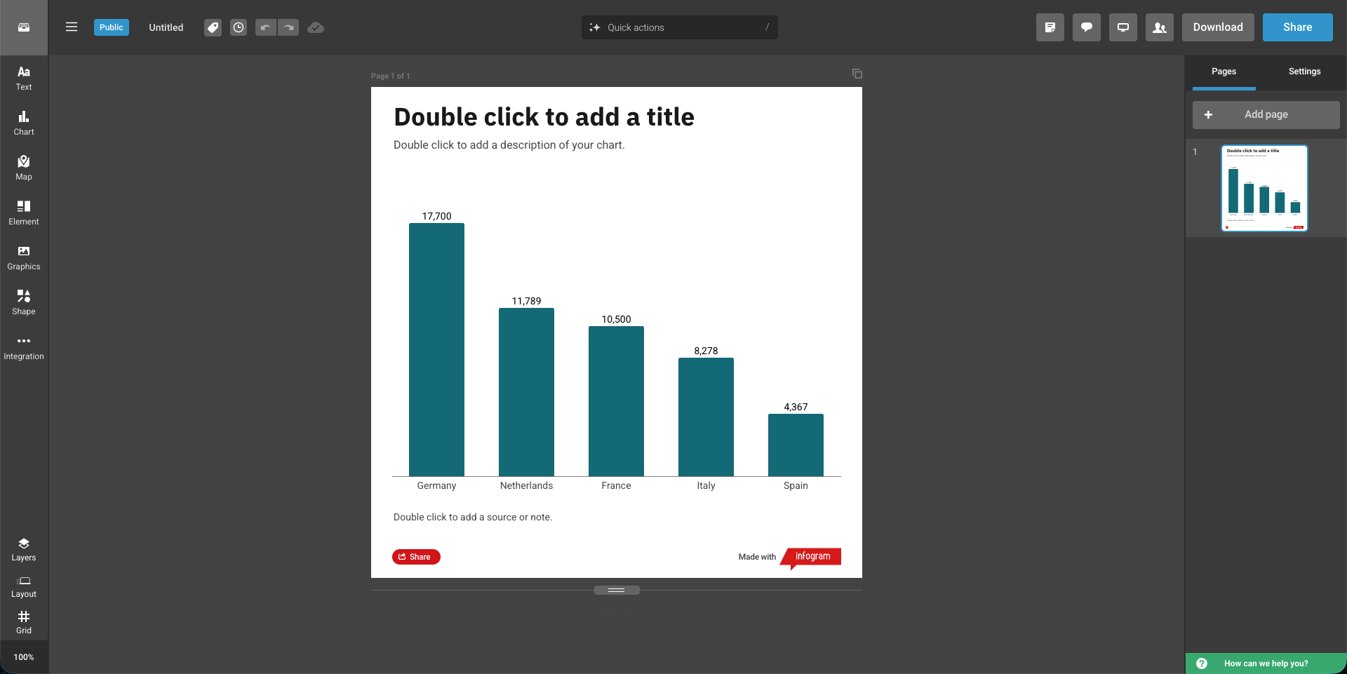
Infogram occupies a unique position on this list: it doesn't try to be an infographic maker for everyone. Operated under Prezi, Inc., it's a visualization engine built for publishing interactive data content on the web. Its target users are data journalists, analysts, and product managers who need charts that respond to user interactions.
The interactivity is real. While other tools output flat PNG/PDF files, Infogram creates content that supports hover-to-view details, legend toggling, and animated data entries. You embed it on web pages via HTML, and edits to the source file auto-update the embed. The map library is particularly deep: beyond country-level maps, you can drill down to specific provinces or postal codes, which is valuable for localized data storytelling.
But there are tradeoffs. Layouts use a structured grid system. Output is clean but less flexible than drag-and-drop design tools. The free plan is quite limited on export options, and serious use typically requires a paid plan. More advanced data connection features (API, SQL) are only available on higher-tier plans. Some users also report that complex interactive charts don't always display ideally on mobile browsers.
Core Features
- 35+ Interactive Chart Types. Pie, line, bar, Gantt, bubble, funnel, treemap, word cloud, scatter, and more
- 800+ Maps. Including custom and local map uploads
- Live Data Connections. Excel, Google Sheets, SQL, API integration
- Interactive Elements. Hover tooltips, clickable elements, animations (zoom, bounce, flip, fade-in)
- Embeddable Publishing. Responsive embed codes, auto-update after edits
- Content Engagement Analytics. Track how audiences interact with your infographics
- AI Chart Recommendations. AI suggests optimal chart types
- SOC 2 Type 2 Certified. Enterprise-grade security compliance
🟢 Pros
- Real interactivity (hover, toggle, animations) that other tools on this list cannot match
- High-precision map library, drillable to province/postal code level
- Live data connections (Google Sheets, JSON feed, SQL), embedded content auto-updates
- Web embedding is the core output format, responsive and smooth
- Adopted by media organizations: USA Today, Amnesty International, Britannica
- SOC 2 Type 2 certified, meeting enterprise compliance requirements
🔴 Cons
- Advanced data features require higher-tier plans ($67-149/mo)
- Structured grid layout ensures clean output but less flexible than drag-and-drop tools
- Complex interactive charts may not display ideally on mobile
- AI features limited to chart type suggestions, not full content generation
- Primarily optimized for web embedding, static export (PNG/PDF) is secondary
Best For
Journalists, newsrooms, data analysts, researchers, marketing teams at data-driven companies, and any organization publishing interactive visual content on the web.
User Reviews
"Infogram has become our benchmark for visual storytelling and has significantly increased viewer engagement across our digital platforms." Donovan Myrie, WKMG News 6
"Increased our productivity as an organization several-fold." Onur Yoruk, The Cato Institute
How to Choose the Right AI Infographic Tool
Choose Based on Your Workflow
Each tool solves a different problem. Before choosing, think about where your bottleneck is:
- You have lots of documents and notes, and want to quickly turn them into infographics? → CartoMind offers lightweight knowledge management and a fully automated workflow, from uploading documents to generating finished products with no design work required.
- You frequently work with spreadsheet data and need charts to auto-update? → Piktochart's Google Sheets live integration and block editor are suited for data reporting scenarios.
- You already use Canva for other designs and want everything on one platform? → Canva has broad ecosystem coverage, ideal for those who need multiple design types simultaneously.
- Your industry has mandatory accessibility compliance requirements? → Venngage has built-in WCAG compliance checking, suited for government and educational institutions.
- You need to embed interactive charts on web pages? → Infogram is purpose-built for interactive data visualization for web publishing.
Choose Based on Budget
| Budget Level | Recommended Tool | Reason |
|---|---|---|
| Free to start | CartoMind or Canva | CartoMind offers free monthly credits, Canva's free plan has rich templates |
| Around $10/mo | CartoMind Starter or Piktochart Pro | CartoMind $9/mo annual, Piktochart $10/mo annual |
| $15-30/mo | Canva Pro or Piktochart Business | Brand management + full features |
| $50+/mo | Infogram Business | Interactive content and advanced data connections |
Individual vs. Team
- Solo creators: CartoMind, Piktochart Pro, or Venngage Premium offer the best value
- Small teams (2-5 people): Canva Teams or Piktochart Business
- Large teams (10+ people): Venngage Business, Infogram Team, or enterprise plans
- Media/newsrooms: Infogram (built for publishing workflows)
Conclusion
Choosing the right AI infographic generator isn't about which tool has the most features. It's about whether the tool matches your specific workflow.
If you work with data-driven reports and long-form business content, Piktochart offers live spreadsheet integration and a block editor. If you want one platform for all design needs, Canva's ecosystem covers a lot of ground. If infographic quality and accessibility compliance are non-negotiable, Venngage is purpose-built for that. If you need interactive data content for web publishing, Infogram specializes in this area.
And if you frequently need to turn research notes, documents, or articles into infographics without spending too much time in design tools, CartoMind offers the approach of lightweight knowledge management plus a fully automated workflow, going from upload to finished infographic in just a few steps. Though as a newer product, it's still continuously improving compared to more established options.
Overall, if I could only recommend one, I'd personally choose CartoMind. It's the tool I use daily. It solved my biggest pain point: no need to switch back and forth between note-taking apps and design tools. Upload a document and get an infographic in a few steps. For people like me who need to continuously produce infographics but don't have a design background, this fully automated approach genuinely saves a lot of time.
Of course, everyone's needs are different. My suggestion is to narrow it down to 2 tools, then use their free plans to test with your real content. The best tool is the one that seamlessly fits into your existing way of working.
FAQ: AI Infographic Generators
What is an AI infographic generator?
An AI infographic generator is a tool that uses artificial intelligence to automatically turn text, data, or documents into visual infographics. You provide the content, and AI handles layout, color scheme, and typography. Different tools vary in automation level. Some still require manual template selection, while others can fully automate the entire process from content analysis to design output.
Do I need design skills to make infographics?
No. AI tools in 2026 have already enabled non-designers to independently produce professional infographics. Canva lowers the barrier through its drag-and-drop interface, while CartoMind skips the design step entirely through its fully automated workflow, generating finished products after you upload documents.
Can I make infographics with AI for free?
Yes. CartoMind offers free monthly credits, Canva's free plan includes basic AI features, Piktochart provides 60 free credits, and Venngage allows 5 free designs. Free plans typically have export format or usage limits. For sustained use, a paid plan at $9-15/mo is recommended.
I have lots of documents and notes. Which tool can I use directly?
CartoMind supports PDF, Word, TXT, and Markdown uploads, automatically parsing and splitting content into selectable segments. Piktochart also supports document upload for auto-generation. Infogram is better suited for structured data (spreadsheets). Canva requires manually copying and pasting content into templates.
What's the difference between a general design platform and a dedicated infographic tool?
General platforms (like Canva) can do everything, with infographics being just one of many features. Dedicated tools are deeply optimized around infographics: CartoMind focuses on automating the path from knowledge management to infographics, Venngage focuses on accessibility compliance, and Infogram focuses on interactive data visualization. Dedicated tools are more efficient for infographic workflows, but narrower in scope.
Are AI-generated infographics professional enough for business use?
Yes. In 2026, infographics generated from curated template libraries (like CartoMind's 500+ design combinations and Canva's 1M+ templates) already meet professional standards for marketing, corporate reports, and social media publishing. More stable than results from AI generating layouts from scratch.
How long does it take to go from document to infographic?
Traditional manual design takes 1-4 hours. Using Canva or Piktochart takes about 10-30 minutes (selecting templates, adjusting layouts, filling content). Fully automated tools (like CartoMind) complete in minutes, as they skip template selection and manual typesetting.
Which tool is best for people who need to produce infographics regularly in bulk?
CartoMind's knowledge management features allow materials to be accumulated and reused, with the fully automated workflow reducing production time per infographic. Ideal for high-frequency output. Canva works for teams that need multiple design types simultaneously. Piktochart is efficient for data reporting scenarios, especially when data sources update regularly.
How is an AI infographic generator different from traditional design tools (like Photoshop)?
Traditional design tools give you complete creative freedom but require professional skills and significant time. The core value of AI infographic generators is automation: you provide the content, the tool handles layout, color scheme, and typography. The two are not replacements for each other. If you're pursuing highly customized artistic expression, traditional tools remain irreplaceable. But if your goal is efficiently turning information into clear visual presentations, AI tools can save you significant time.